Transforms
The transform property comes in two different settings, two-dimensional and three-dimensional. Each of these come with their own individual properties and values.
Transform Syntax
The actual syntax for the transform property is quite simple, including the transform property followed by the value. The value specifies the transform type followed by a specific amount inside parentheses.

2D Transforms
Elements may be distorted, or transformed, on both a two-dimensional plane or a three-dimensional plane. Two-dimensional transforms work on the x and y axes, known as horizontal and vertical axes. Three-dimensional transforms work on both the x and y axes, as well as the z axis. These three-dimensional transforms help define not only the length and width of an element, but also the depth. We’ll start by discussing how to transform elements on a two-dimensional plane, and then work our way into three-dimensional transforms.
2D Scale: Using the scale value within the transform property allows you to change the appeared size of an element. The default scale value is 1, therefore any value between .99 and .01 makes an element appear smaller while any value greater than or equal to 1.01 makes an element appear larger.
Combining Transforms
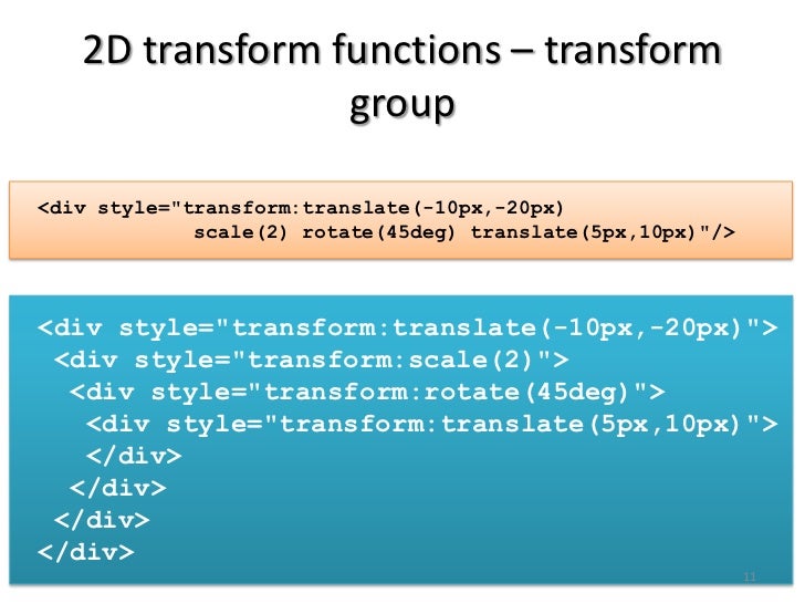
It is common for multiple transforms to be used at once, rotating and scaling the size of an element at the same time for example. In this event multiple transforms can be combined together. To combine transforms, list the transform values within the transform property one after the other without the use of commas.

Translate
2D Translate
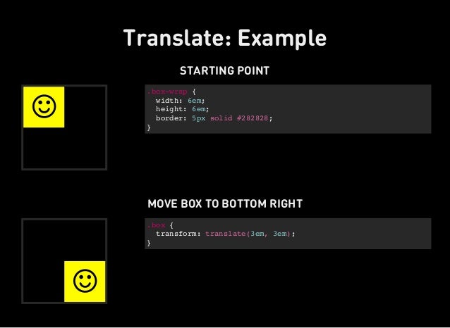
The translate value works a bit like that of relative positioning, pushing and pulling an element in different directions without interrupting the normal flow of the document. Using the translateX value will change the position of an element on the horizontal axis while using the translateY value will change the position of an element on the vertical axis.
- 2D Skew: The last transform value in the group, skew, is used to distort elements on the horizontal axis, vertical axis, or both. The syntax is very similar to that of the scale and translate values. Using the skewX value distorts an element on the horizontal axis while the skewY value distorts an element on the vertical axis. To distort an element on both axes the skew value is used, declaring the x axis value first, followed by a comma, and then the y axis value.%p
3D Translate
Elements may also be translated on the z axis using the translateZ value. A negative value here will push an element further away on the z axis, resulting in a smaller element. Using a positive value will pull an element closer on the z axis, resulting in a larger element.
Transitions & Animations
With CSS3 transitions you have the potential to alter the appearance and behavior of an element whenever a state change occurs, such as when it is hovered over, focused on, active, or targeted.
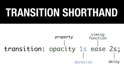
Animations within CSS3 allow the appearance and behavior of an element to be altered in multiple keyframes. Transitions provide a change from one state to another, while animations can set multiple points of transition upon different keyframes. There are four transition related properties in total, including transition-property, transition-duration, transition-timing-function, and transition-delay. Not all of these are required to build a transition, with the first three are the most popular.
- Transitional Property
The transition-property property determines exactly what properties will be altered in conjunction with the other transitional properties. By default, all of the properties within an element’s different states will be altered upon change. However, only the properties identified within the transition-property value will be affected by any transitions.

Animations
Transitions do a great job of building out visual interactions from one state to another, and are perfect for these kinds of single state changes. However, when more control is required, transitions need to have multiple states. In return, this is where animations pick up where transitions leave off.

- Animation Direction On top of being able to set the number of times an animation repeats, you may also declare the direction an animation completes using the animation-direction property. Values for the animation-direction property include normal, reverse, alternate, and alternate-reverse.
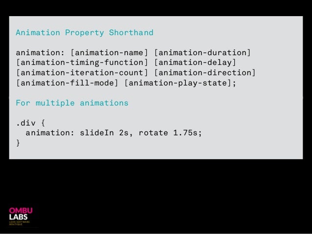
- Shorthand Animations
Fortunately animations, just like transitions, can be written out in a shorthand format. This is accomplished with one animation property, rather than multiple declarations. The order of values within the animation property should be animation-name, animation-duration, animation-timing-function, animation-delay, animation-iteration-count, animation-direction, animation-fill-mode, and lastly animation-play-state.
CSS3 has introduced countless possibilities for UX designers, and the best thing about them is that the coolest parts are really simple to implement.
Just a couple of lines of code will give you an awesome transition effect that will excite your users, increase engagement and ultimately, when used well, increase your conversions. What’s more, these effects are hardware accelerated, and a progressive enhancement that you can use right now.
- Fade in: Fade in effects are coded in two steps: first, you set the initial state; next, you set the change
- Change color: Animating a change of color used to be unbelievably complex, with all kinds of math involved in calculating separate RGB values and then recombining them.
- Grow & Shrink:To grow an element, you used to have to use its width and height, or its padding. But now we can use CSS3’s transform to enlarge.
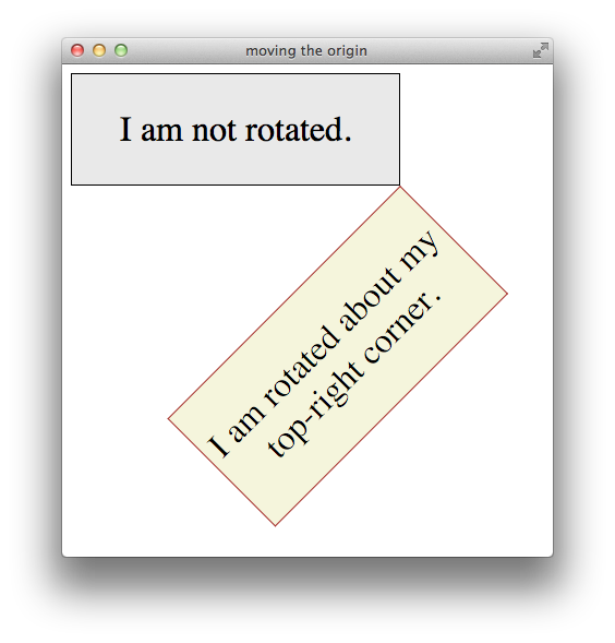
- Rotate elements: CSS transforms have a number of different uses, and one of the best is transforming the rotation of an element.
- Square to circle:A really popular effect at the moment is transitioning a square element into a round one, and vice versa. With CSS, it’s a simple effect to achieve, we just transition the border-radius property.
- 3D shadow: 3D shadows were frowned upon for a year or so, because they weren’t seen as compatible with flat design, which is of course nonsense, they work fantastically well to give a user feedback on their interactions and work with flat, or fake 3D interfaces.

This effect is achieved by adding a box shadow, and then moving the element on the x axis using the transform and translate properties so that it appears to grow out of the screen.
- Swing: Not all elements use the transition property. We can also create highly complex animations using @keyframes, animation and animation-iteration.
- Inset border: One of the hottest button styles right now is the ghost button; a button with no background and a heavy border. We can of course add a border to an element simply, but that will change the element’s position. We could fix that problem using box sizing, but a far simpler solution is the transition in a border using an inset box shadow.
Buttons animated :Blam,Sky,Later
