class-05
From the Duckett HTML book
Images
Choosing Images for Your Site
A picture can say a thousand words, and great images help make the difference between an average-looking site and a really engaging one.
Adding Images
To add an image into the page you need to use an img element. This is an empty element (which means there is no closing tag). It must carry the following two attributes: - src This tells the browser where it can find the image file. This will usually be a relative URL pointing to an image on your own site. (Here you can see that the images are in a child folder called images —relative URLs were covered on pages 83-84). - alt This provides a text description of the image which describes the image if you cannot see it. Title You can also use the title attribute with the img element to provide additional information about the image. Most browsers will display the content of this attribute in a tootip when the user hovers over the image.
Height & Width of Images
You will also often see an img element use two other attributes that specify its size: Height This specifies the height of the image in pixels. Width This specifies the width of the image in pixels
Where to Place Images in Your Code
- before a paragraph
- inside the start of a paragraph
- in the middle of a paragraph
Old Code: Aligning Images Horizontally
- left This aligns the image to the left (allowing text to flow around its right-hand side).
- right This aligns the image to the right (allowing text to flow around its left-hand side)
- Old Code: Aligning Images Vertically
- top This aligns the first line of the surrounding text with the top of the image.
- middle This aligns the first line of the surrounding text with the middle of the image.
- bottom This aligns the first line of the surrounding text with the bottom of the image.
Three Rules for Creating Images There are three rules to remember when you are creating images for your website which are summarized below.
- Save images in the right format
- Save images at the right size
- Use the correct resolution
There are several tools you can use to edit and save images to ensure that they are the right size, format, and resolution.
Image Formats:
Cropping Images
Image Resolution
Images created for the web should be saved at a resolution of 72 ppi. The higher the resolution of the image, the larger the size of the file.
Vector Images
Vector images differ from bitmap images and are resolution-independent. Vector images are commonly created in programs such as Adobe Illustrator.
Animated GIFs
Animated GIFs show several frames of an image in sequence and therefore can be used to create simple animations.
HTML5: Figure and Figure Caption
Images often come with captions. HTML5 has introduced a new figure element to contain images and their caption so that the two are associated. You can have more than one image inside the figure element as long as they all share the same caption.
The figcaption element has been added to HTML5 in order to allow web page authors to add a caption to an image.Before these elements were created there was no way to associate an element with its caption.
Colors
The color property allows you to specify the color of text inside an element. You can specify any color in CSS in one of three ways:
- rgb values These express colors in terms of how much red, green and blue are used to make it up. For example: rgb(100,100 90)
- hex codes These are six-digit codes that represent the amount of red, green and blue in a color, preceded by a pound or hash # sign.For example: #ee3e80 color
- names There are 147 predefined color names that are recognized by browsers. For example: DarkCyan
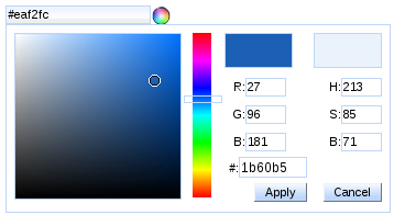
Every color on a computer screen is created by mixing amounts of red, green, and blue. To find the color you want you can use a color picker.
CSS3: HSL Colors
CSS3 introduces an entirely new and intuitive way to specify colors using hue, saturation, and lightness values.
- hue Hue is the colloquial idea of color. In HSL colors, hue is often represented as a color circle where the angle represents the color, although it may also be shown as a slider with values from 0 to 360.
- saturation Saturation is the amount of gray in a color. Saturation is represented as a percentage. 100% is full saturation and 0% is a shade of gray.
- lightness Lightness is the amount of white (lightness) or black (darkness) in a color. Lightness is represented as a percentage. 0% lightness is black, 100% lightness is white, and 50% lightness is normal. Lightness is sometimes referred to as luminosity
- It is important to ensure that there is enough contrast between any text and the background color (otherwise people will not be able to read your content).
- Color pickers can help you find the color you want.
- CSS3 has introduced an extra value for RGB colors to indicate opacity. It is known as RGBA.
- CSS3 also allows you to specify colors as HSL values,with an optional opacity value. It is known as HSLA.
Text
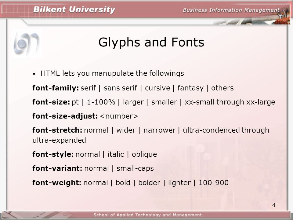
Typeface Terminology
- Serif: Serif fonts have extra details on the ends of the main strokes of the letters. These details are known as serifs.
- Sans-Serif Sans-serif fonts have straight ends to letters, and therefore have a much cleaner design.
- Monospace Every letter in a monospace (or fixed-width) font is the same width. (Non-monospace fonts have different widths.)
Fonts:
-
Bold font-weight The font-weight property allows you to create bold text. There are two values that this property commonly takes: normal This causes text to appear at a normal weight. bold This causes text to appear bold. In this example, you can see that the element whose class attribute has a value of credits has been bolded.
- Italic >font-style
If you want to create italic text, you can use the font-style property. There are three values this property can take:
- normal: This causes text to appear in a normal style (as opposed to italic or oblique).
- Italic: This causes text to appear italic.
- oblique This causes text to appear oblique.
- UpperCase & LowerCase >text-transform
The text-transform property is used to change the case of text giving it one of the following values:
- uppercase This causes the text to appear uppercase.
- lowercase This causes the text to appear lowercase.
- capitalize This causes the first letter of each word to appear capitalized.
- Underline & Strike >text-decoration
The text-decoration property allows you to specify the following values:
- none This removes any decoration already applied to the text.
- underline This adds a line underneath the text.
- overline This adds a line over the top of the text. line-through This adds a line through words.
- blink This animates the text to make it flash on and off (however this is generally frowned upon, as it is considered rather annoying).
-
Leading > line-height Leading (pronounced ledding) is a term typographers use for the vertical space between lines of text. In a typeface, the part of a letter that drops beneath the baseline is called a descender, while the highest point of a letter is called the ascender. Leading is measured from the bottom of the descender on one line to the top of the ascender on the next.
-
Letter & Word Spacing >letter-spacing, word-spacing: Kerning is the term typographers use for the space between each letter. You can control the space between each letter with the letter-spacing property.
- Alignment >text-align
The text-align property allows you to control the alignment of text. The property can take one of four values:
- left This indicates that the text should be left-aligned.
- right This indicates that the text should be right-aligned.
- center This allows you to center text.
- justify This indicates that every line in a paragraph, except the last line, should be set to take up the full width of the containing box.
Indenting Text text-indent The text-indent property allows you to indent the first line of text within an element. The amount you want the line indented by can be specified in a number of ways but is usually given in pixels or ems.
- Techniques That Offer a Wider Choice of Typefaces: There are several ways to use fonts other than those listed However, typefaces are subject to copyright, so the techniques you can choose from are limited by their respective licenses.

-
Specifying Typefaces The font-family property allows you to specify the typeface that should be used for any text inside the element(s) to which a CSS rule applies. The value of this property is the name of the typeface you want to use.
-
Size of Type The font-size property enables you to specify a size for the font. There are several ways to specify the size of a font. The most common are: pixels Pixels are commonly used because they allow web designers very precise control over how much space their text takes up. The number of pixels is followed by the letters px. percentages The default size of text in browsers is 16px. So a size of 75% would be the equivalent of 12px, and 200% would be 32px.
-
Type Scales You may have noticed that programs such as Word, Photoshop and InDesign offer the same sizes of text. This is because they are set according to a scale or ratio that was developed by European typographers in the sixteenth century. It is considered that this scale for type is pleasing to the eye and it has therefore changed little in the last 400 years. For this reason, when you are designing pages, using sizes from this scale will help them look more attractive.
-
Units of Type Size
- Pixels
- Percentages
- Ems
- More Font Choice
@font-face allows you to use a font, even if it is not installed on the computer of the person browsing, by allowing you to specify a path to a copy of the font, which will be downloaded if it is not on the user’s machine.
font-family
This specifies the name of the font. This name can then be used as a value of the font-family property in the rest of the style sheet (as shown in the rule for the *h1 and h2 elements).*
src
This specifies the path to the font. In order for this technique to work in all browsers, you will probably need to specify paths to a few different versions of the font, as shown on the next page.
Format
This specifies the format that the font is supplied in. (It’s discussed in detail on the next page.)
CSS3: Drop Shadow >text-shadow
The text-shadow property has become commonly used despite lacking support in all browsers. It is used to create a drop shadow, which is a dark version of the word just behind it and slightly offset. It can also be used to create an embossed effect by adding a shadow that is slightly lighter than the text
-
First Letter or Line >:first-letter, :first-line You can specify different values for the first letter or first line of text inside an element using :first-letter and :first-line. Technically these are not properties. They are known as pseudo-elements. You specify the pseudo-element at the end of the selector, and then specify the declarations as you would normally for any other element
-
Styling Links :link, :visited Browsers tend to show links in blue with an underline by default, and they will change the color of links that have been visited to help users know which pages they have been to. In CSS, there are two pseudoclasses that allow you to set different styles for links that have and have not yet been visited.
- :link This allows you to set styles for links that have not yet been visited.
- :visited This allows you to set styles for links that have been clicked on. They are commonly used to control colors of the links and also whether they are to appear underlined or not.
-
Responding to Users :hover, :active, :focus There are three pseudo-classes that allow you to change the appearance of elements when a user is interacting with them.
- :hover This is applied when a user hovers over an element with a pointing device such as a mouse. This has commonly been used to change the appearance of links and buttons when a user places their cursor over them. It is worth noting that such events do not work on devices that use touch screens (such as the iPad) because the screen is not able to tell when someone is hovering their finger over an element.
-
:active This is applied when an element is being activated by a user; for example, when a button is being pressed or a link being clicked. Sometimes this is used to make a button or link feel more like it is being pressed by changing the style or position of the element slightly.
- :focus This is applied when an element has focus. Any element that you can interact with, such as a link you can click on or any form control can have focus.
You can use pseudo-classes to change the style of an element when a user hovers over or clicks on text, or when they have visited a link.
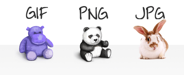
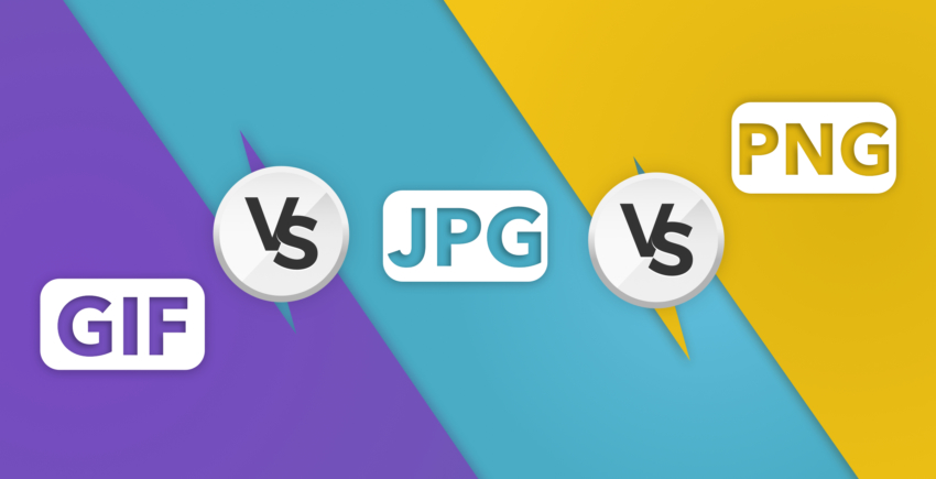
JPEG vs PNG vs GIF
Photographs are best saved as JPEGs; illustrations or logos that use flat colors are better saved as GIFs.
-
TL;DR Use JPEG format for all images that contain a natural scene or photograph where variation in colour and intensity is smooth. Use PNG format for any image that needs transparency or for images with text & objects with sharp contrast edges like logos. Use GIF format for images that contain animations.
-
Compression Almost all forms of data that we see on the internet — text, image, video etc. — are compressed to reduce the size of data and ensure faster transmission. Choosing the correct format and compression is a major factor that determines image size.
- JPEG is a lossy compression specification that takes advantage of human perception.
- PNG is a lossless image format using DEFLATE compression. No data is lost during compression and no compression artefacts are introduced in the image.
- GIF is also a lossless image format that uses LZW compression algorithm. It was favoured over PNG for simple graphics in websites in its early days because the support of PNG was still growing.
-
Transparency In a simple form, transparency indicates something that is completely invisible. Logos and icons often need to be placed on backgrounds with variable colours. Hence it is desirable, that the background of these logos and icons is made transparent so that a single image can be used over multiple background variations.
- JPEG images don’t support transparency and are hence not usable for such cases.
- PNG images support transparency in two ways — inserting an alpha channel that allows partial transparency or by declaring a single colour as transparent (index transparency). Partial transparency makes the edges blend smoothly into the background. PNG8 images (discussed in the “Colours” section below) can support only index transparency whereas PNG24 images can support alpha channel transparency.
- GIF images support transparency by declaring a single colour in the colour palette as transparent (index transparency). Because of absence of partial transparency, the edges (specially rounded or too-detailed edges) get a poor jagged effect. Though this can be solved to some extent using dithering, with improved PNG support, GIF is unsuitable for images with transparent backgrounds.
Colours
There is a significant difference in the number of colours that can be supported by these 3 formats.
- JPEG images can support around 16 million colours. This is what makes them suitable for storing images of natural scenes.
- PNG images mainly have two modes — PNG8 and PNG24. PNG8 can support upto 256 colours whereas PNG24 can handle upto 16 million colours like a JPEG image. Use PNG8 for simple shapes with fewer colours and PNG24 for high quality, complex logos and shapes with rounded corners on a transparent background.
-
GIF images are limited to 256 colours. If index transparency is used, then one of these 256 colours is assigned as transparent and the remaining 255 are used for other colours.
- Animation Animation, in this case, refers to any change or movement in the image. It doesn’t necessarily have to have frame rates like an animated video, but essentially a part or the entire image changes with time.
Of these 3 formats, only GIF supports animation. This capability makes GIF format suitable for delivering engaging ads and banners.
/blogmerge/cf67f56e-00e6-48c0-a1a4-31a8e3baf0de.jpeg)